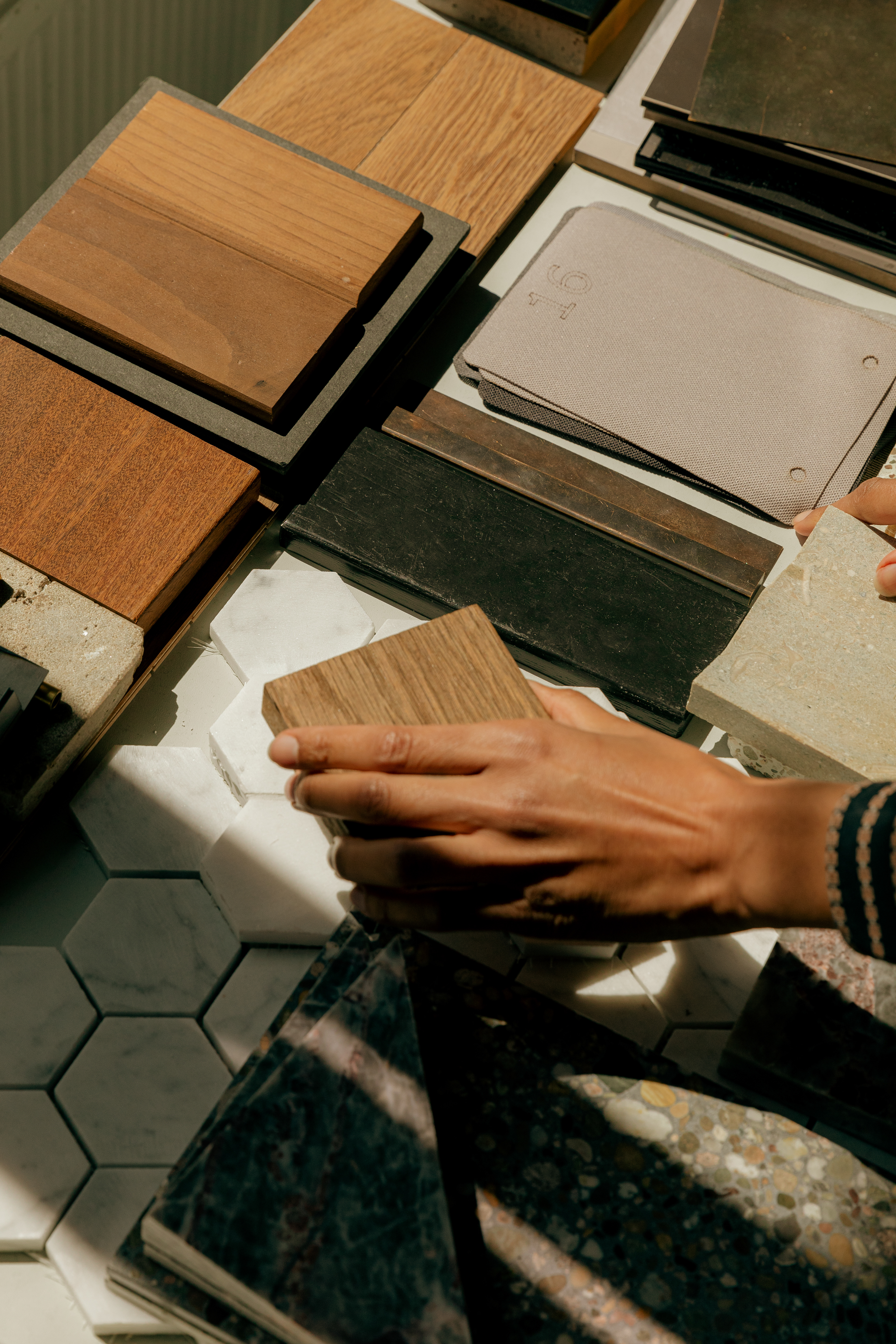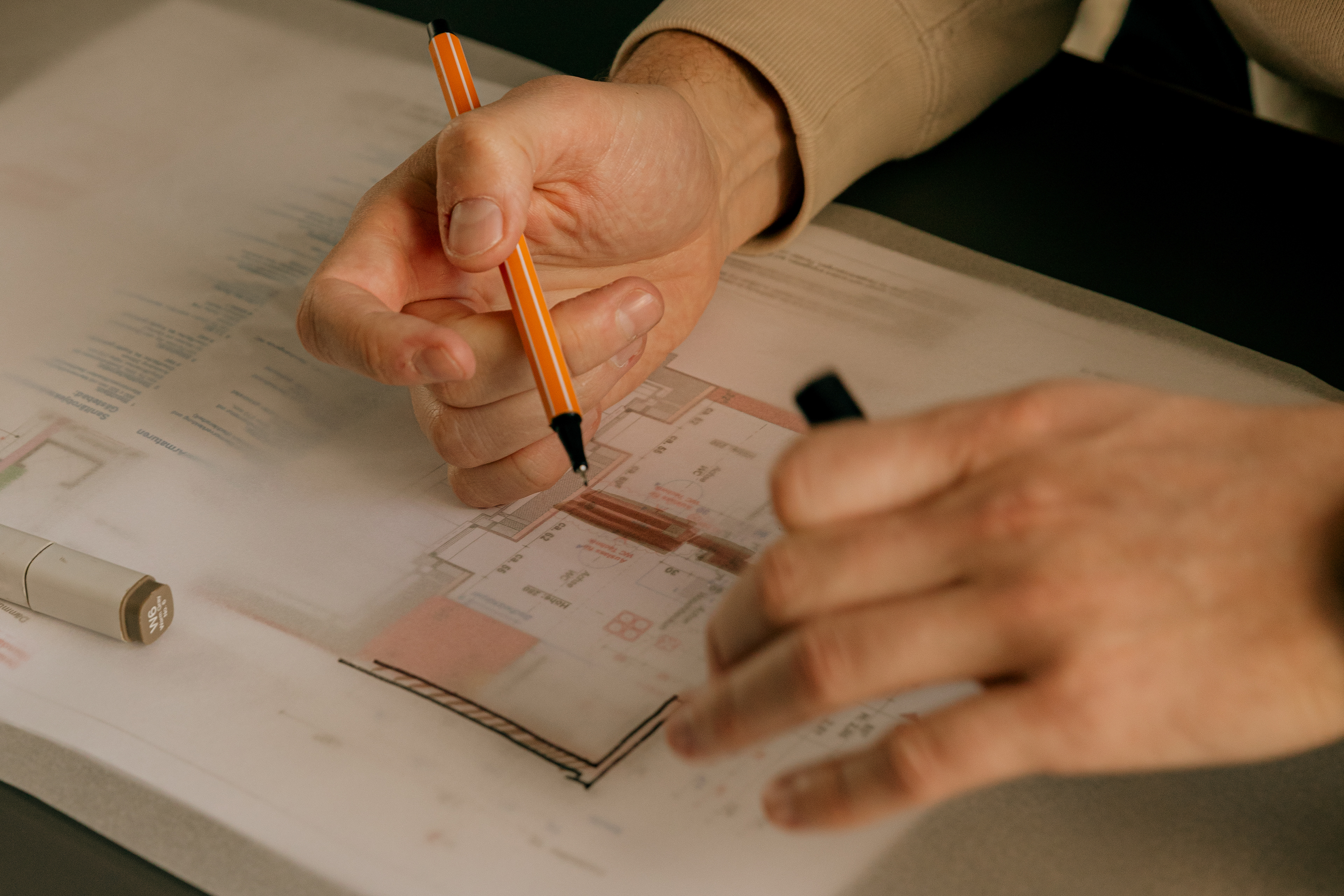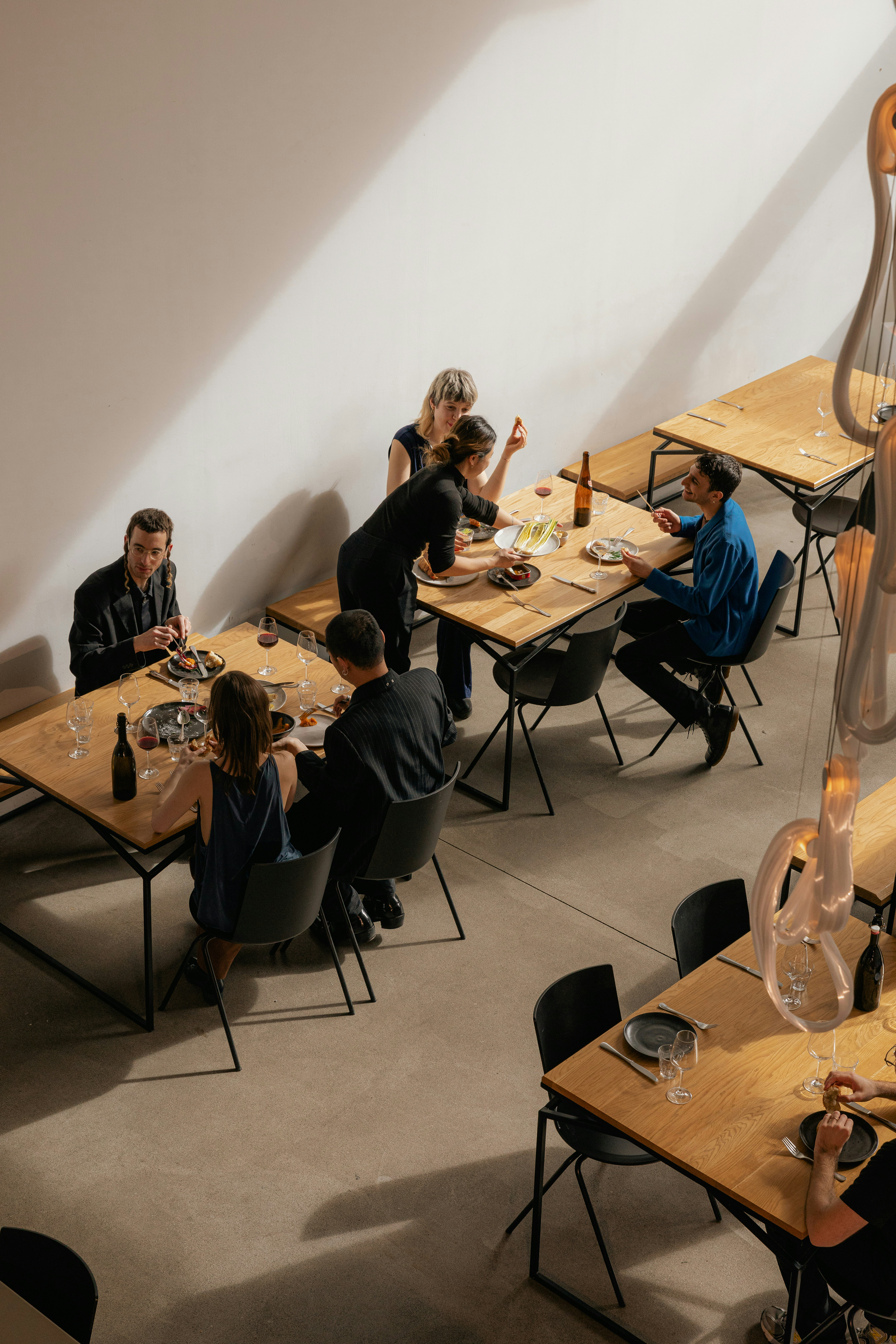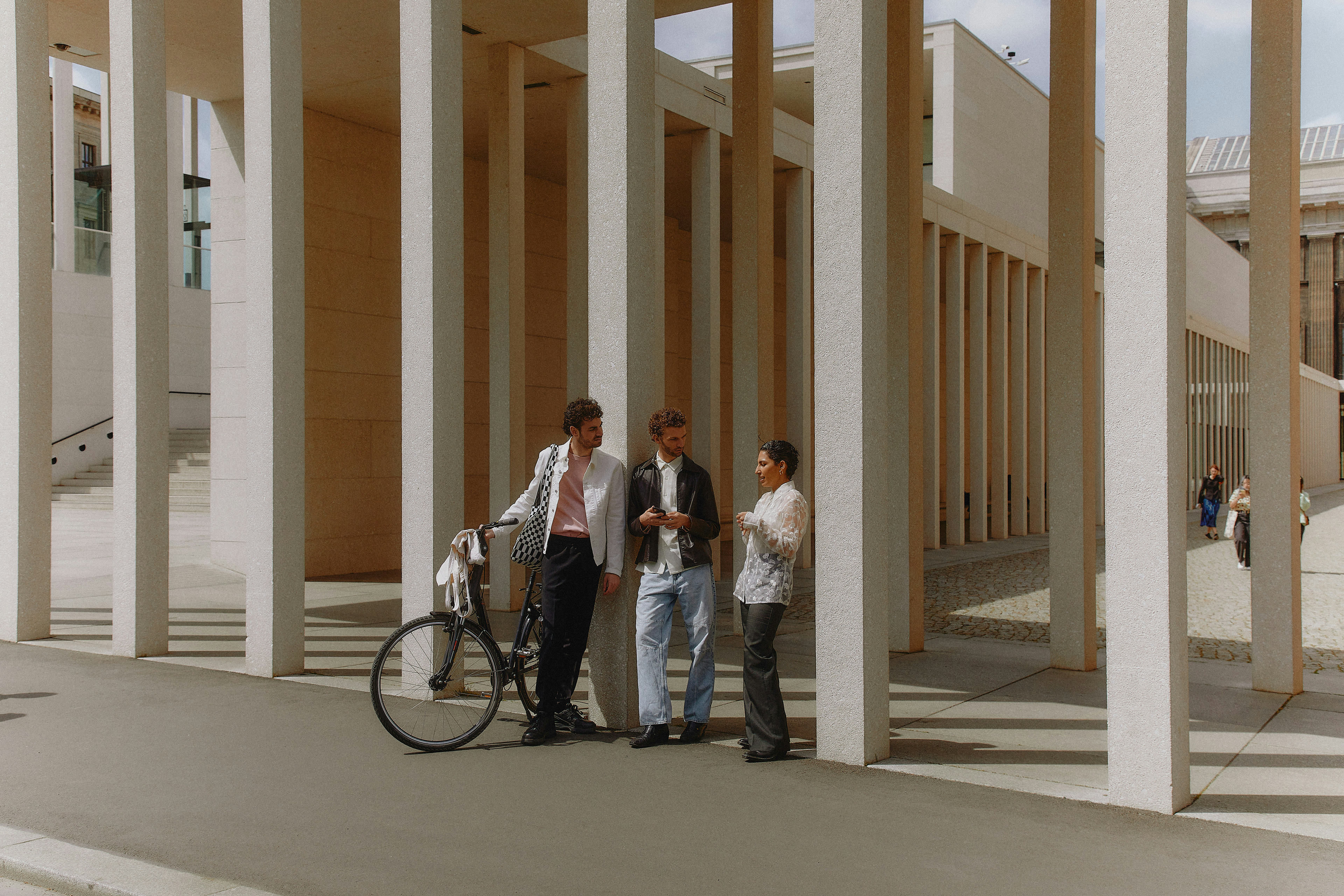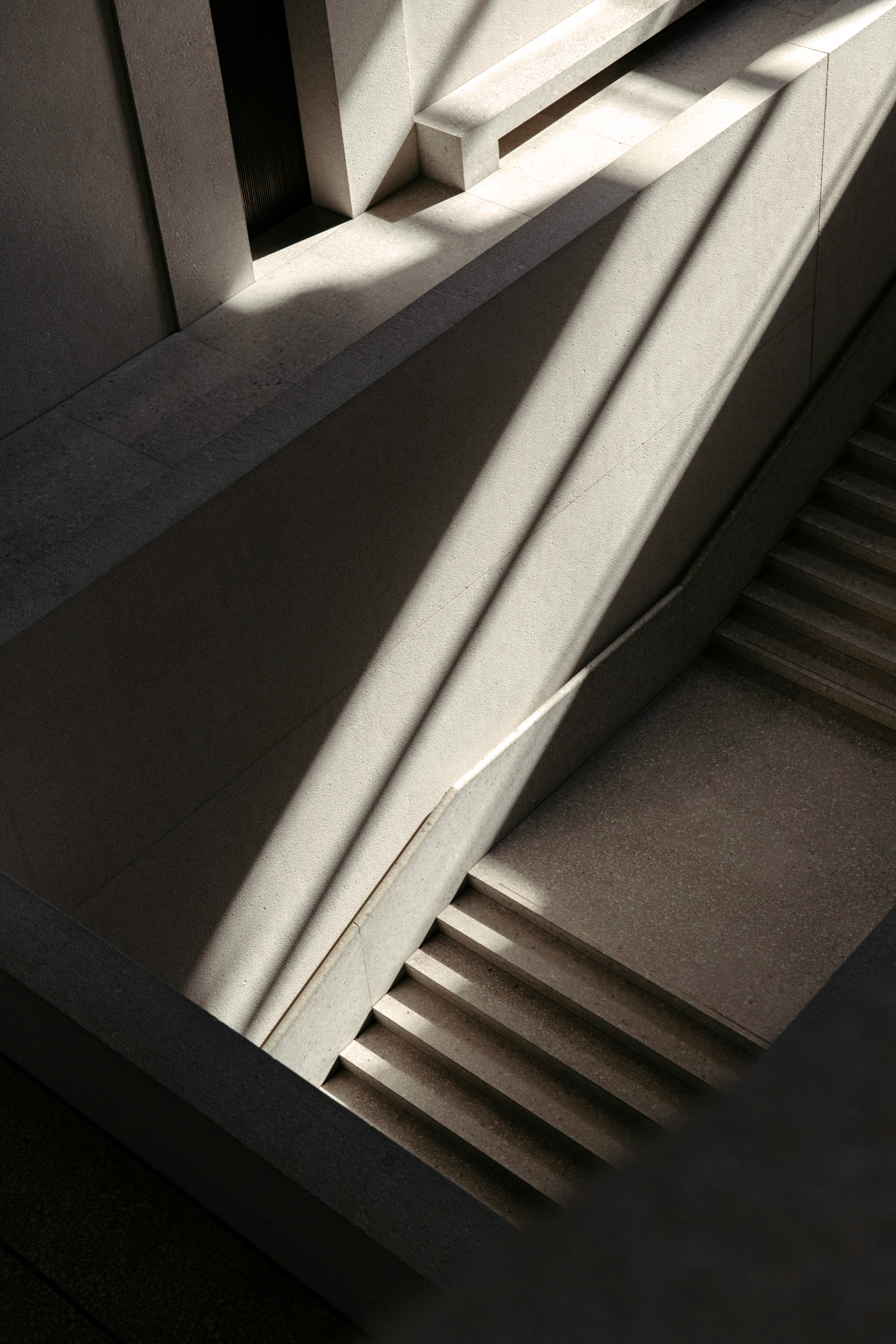
BRIEF
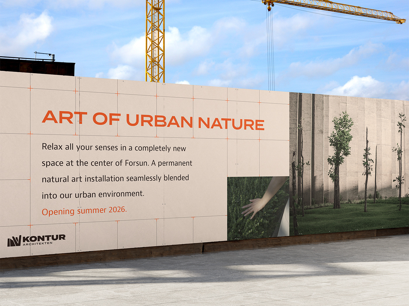
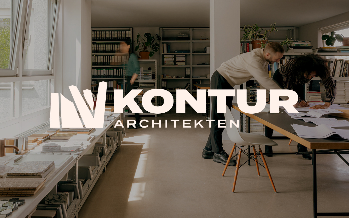
Kontur Architekten is a fictional architectural firm based in Germany. They conceptualize, design and draw public buildings in a modern brutalist style, as well as monuments and art pieces in the same vein. Their works don't convey much in themselves, the point is to remove distractions so the people, nature and other objects are allowed to give life to the spaces. Kontur focus on giving room for light and sound to have all the senses experience the spaces.
"Minimal, functional, honest. Unique yet familiar. Precise."

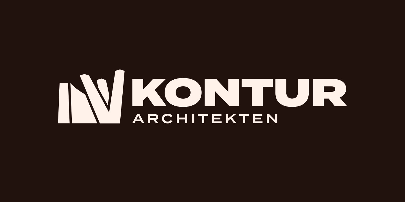
LOGO
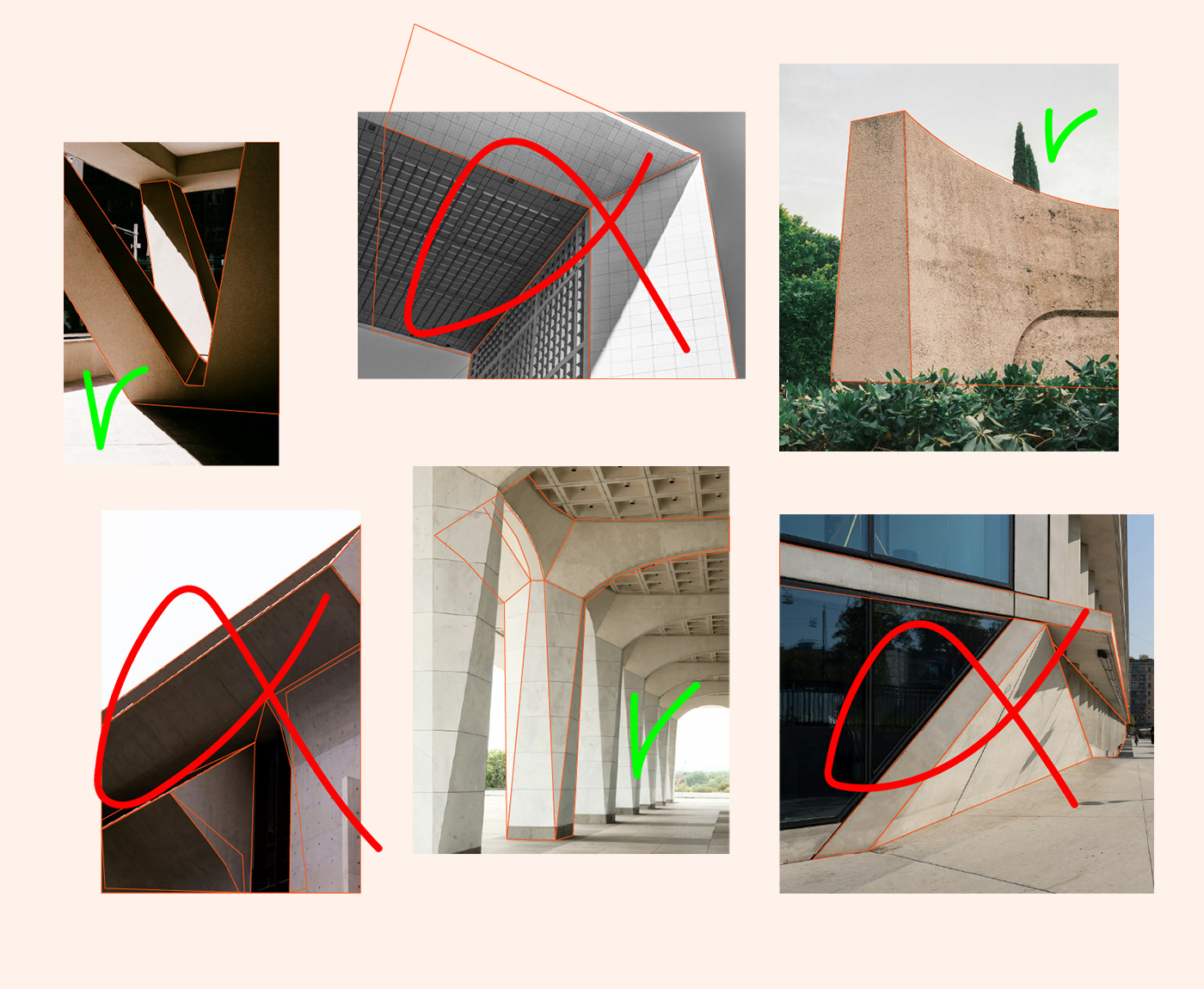
The logomark is based on stylistically appropriate buildings and monuments.The goal was to find brutalist architectural elements leaning more towards art. From the nine picked, four were deemed suitable in regards to clear shape and symbolic meaning.
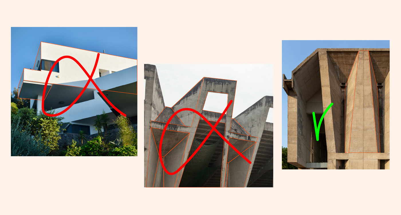
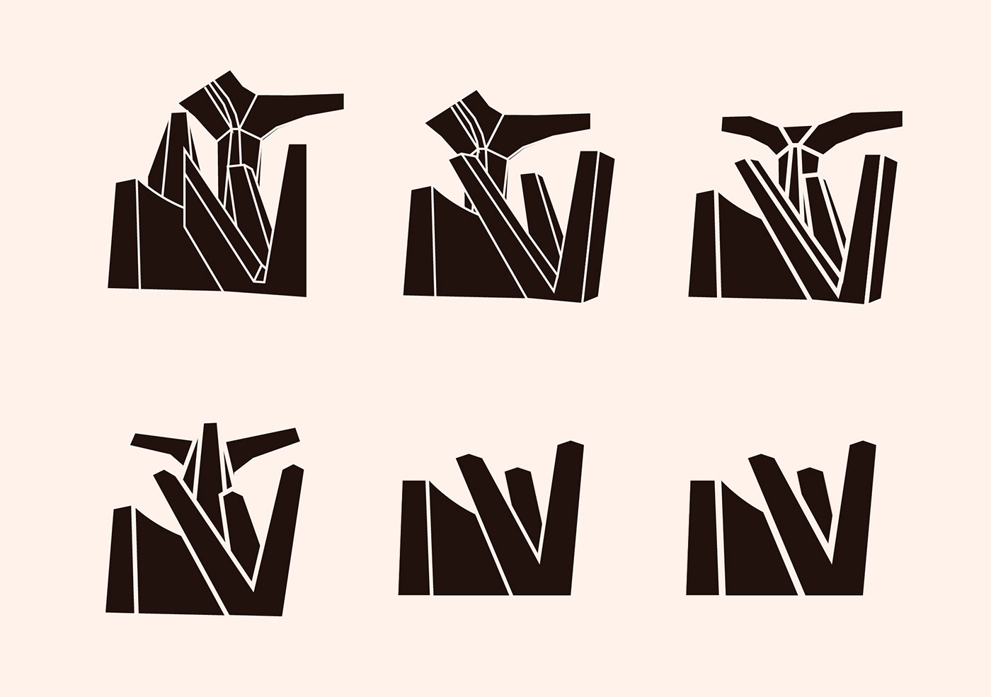
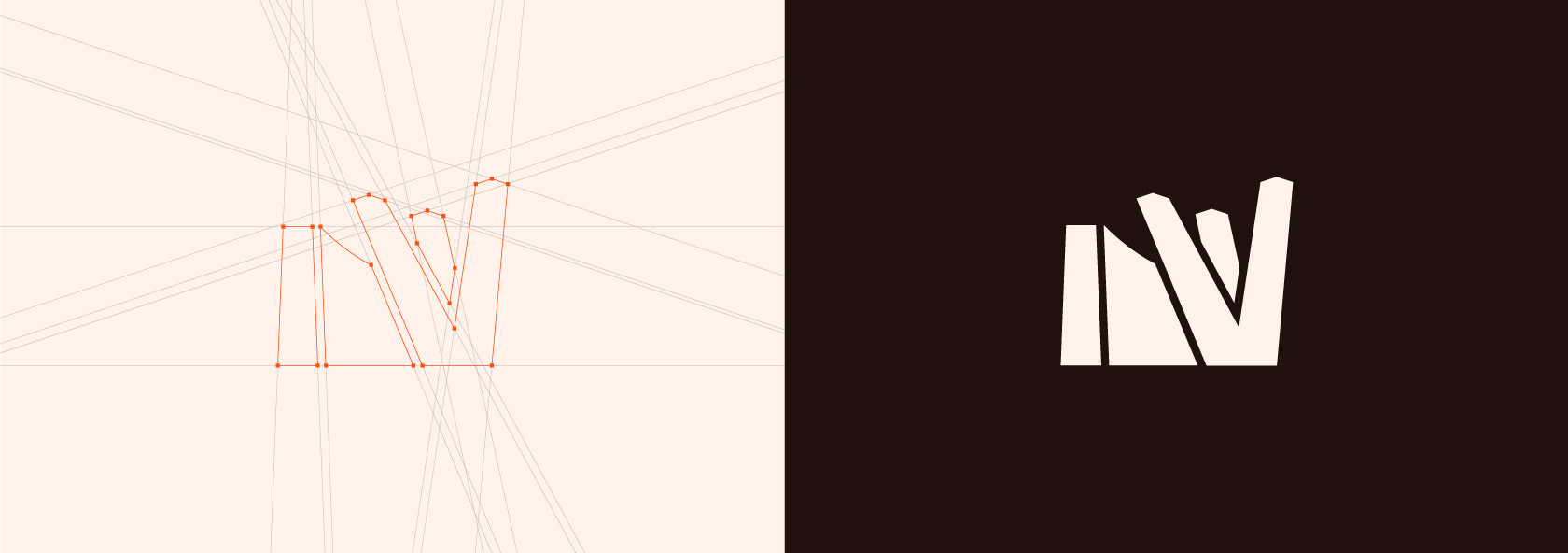
The four components became two after testing different compositions and levels of detail. They were chosen because of the level of simplicity they could reach, how they work together and finally what their shapes, lines and motion symbolize. The logomark represents stability, precision, reaching, openness and life through motion.
Continuing on the theme of stability - the typeface used for the wording in the logotype is large, bold and represents the grand scale of brutalist architecture.
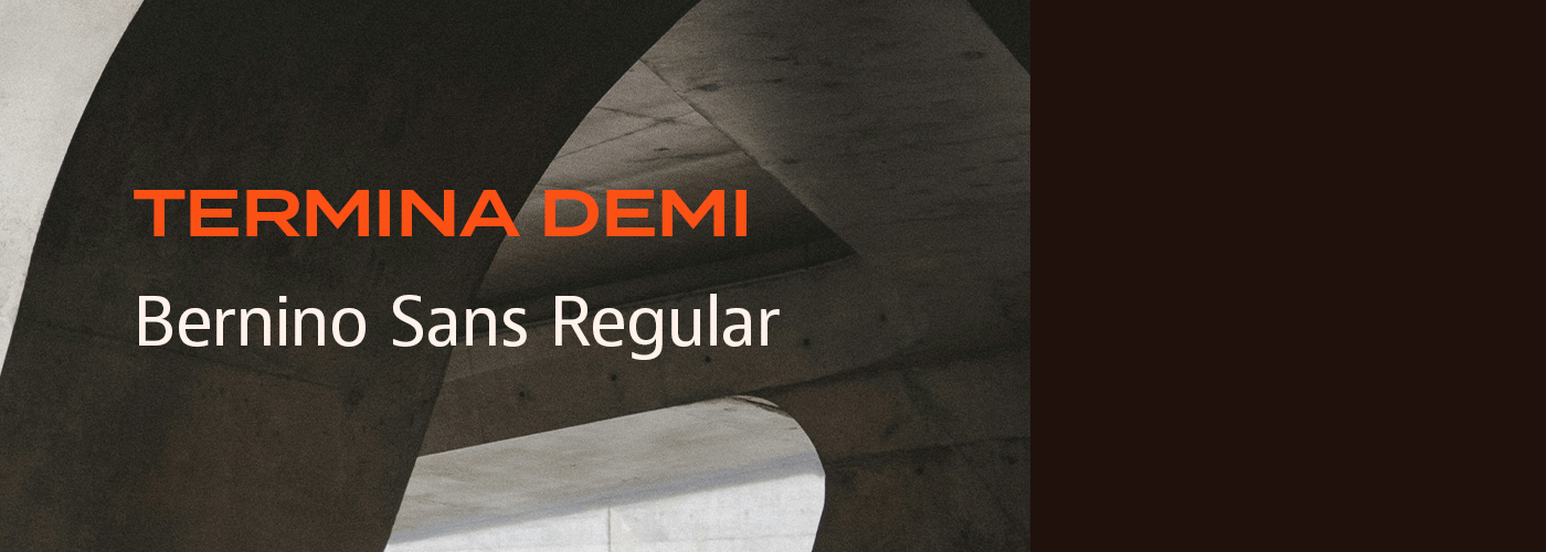
TYPE AND COLOR
The typefaces for text are a continuation of the one used in the logo. Headers use the same as the logo but in a different weight, to differentiate without losing connection. The typeface for the body is different but keeps a heavier weight for a better match.
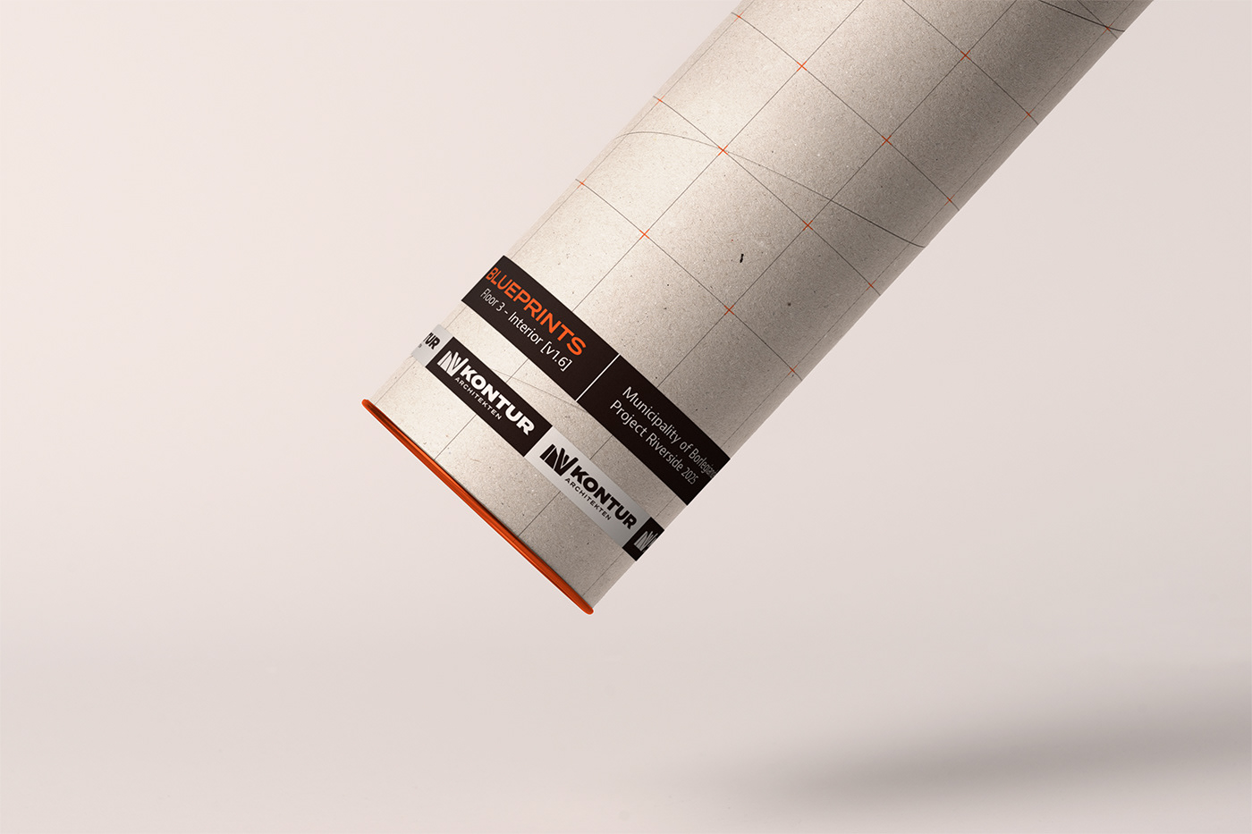
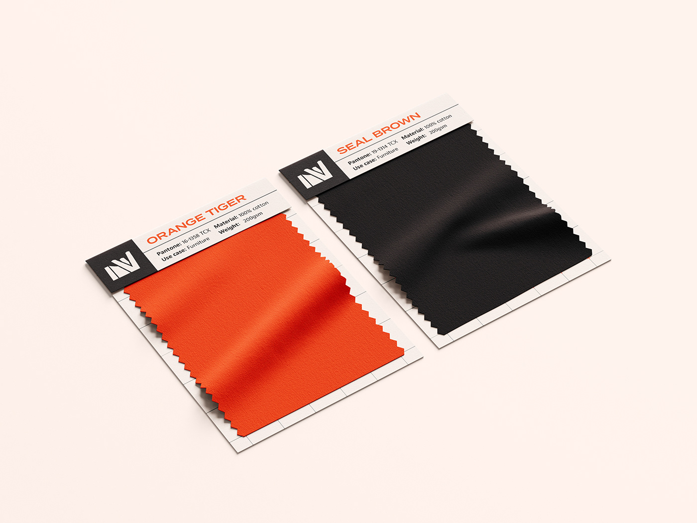
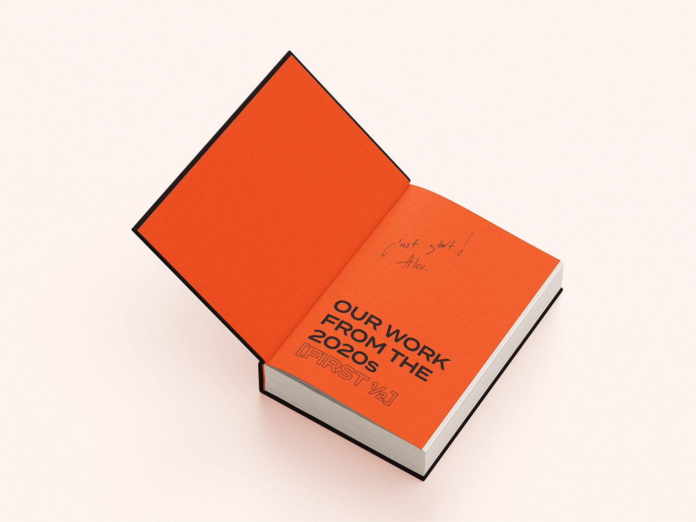
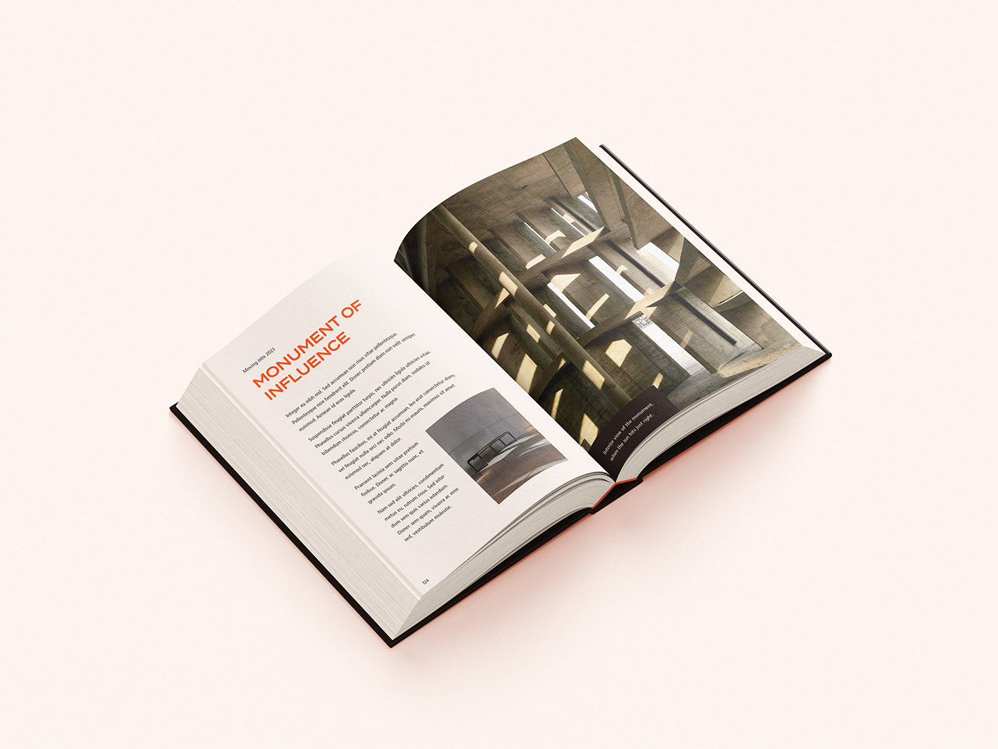
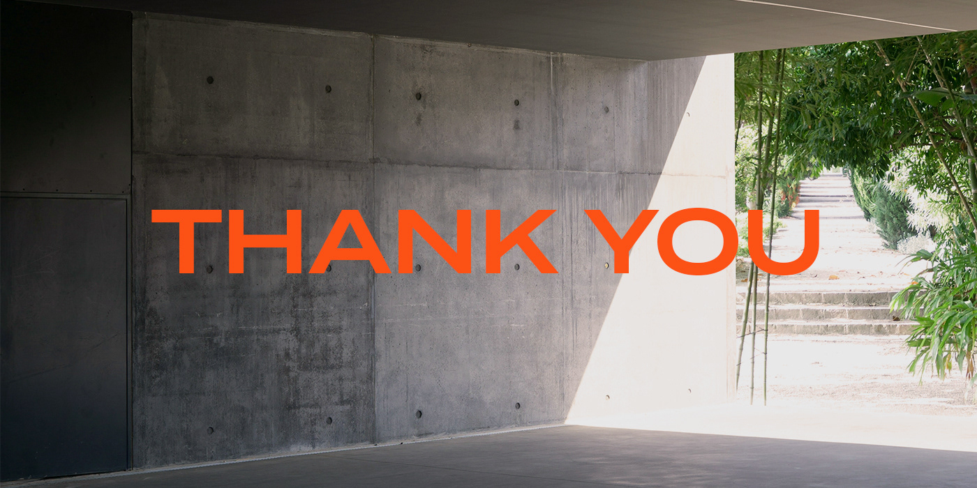
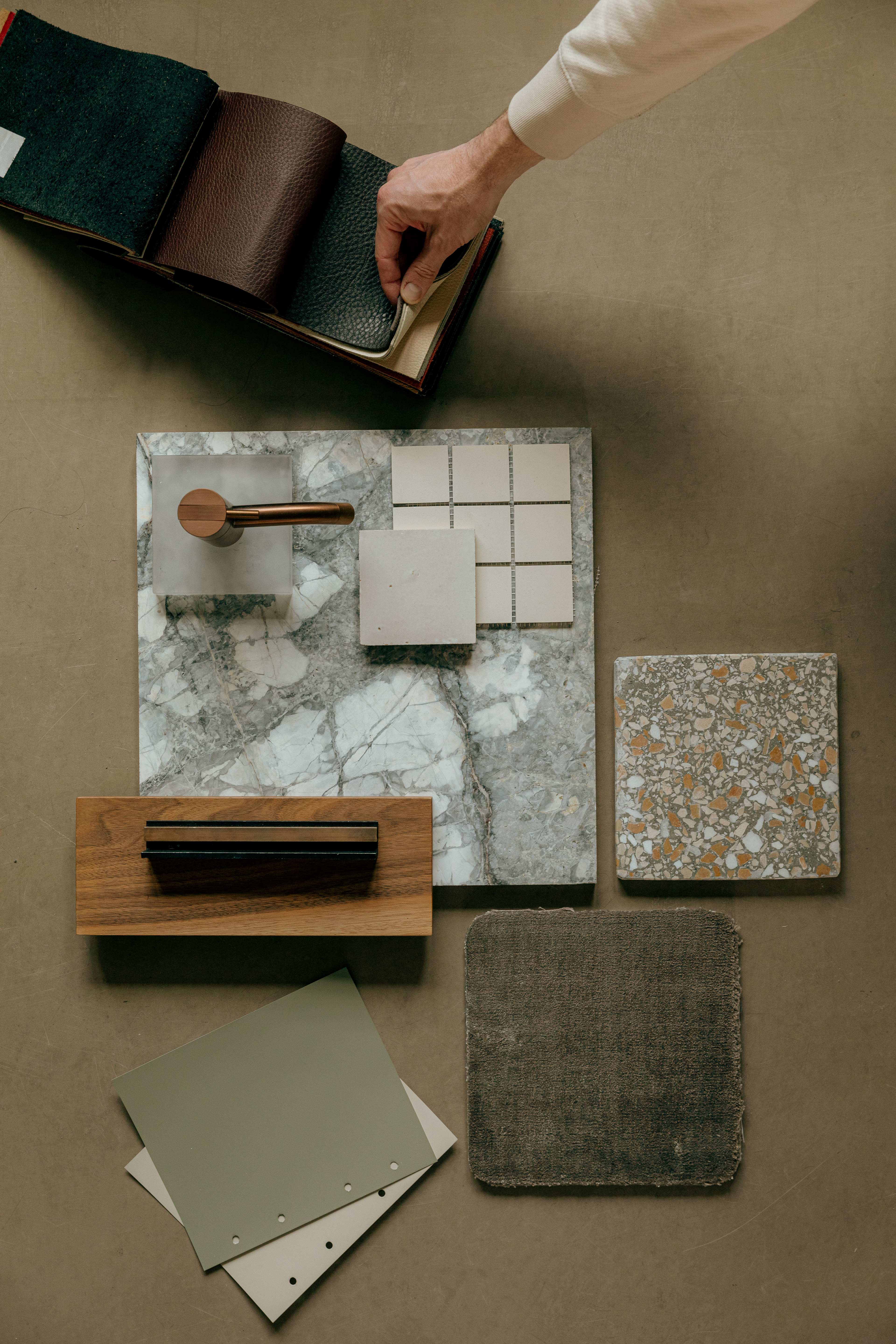
Kontur uses three colors: the brown and beige as the dark and light base colors, and then the orange for accents. The aim was to get a retro feeling, connecting with the era when brutalism was most popular (around the 60s).