The family-run lamp store has a long history, spanning generations. The time had come to break away from the chain of stores they had belonged to for some time. So, they needed a light branding done with a logo and simple design system.
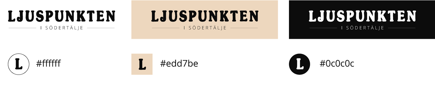
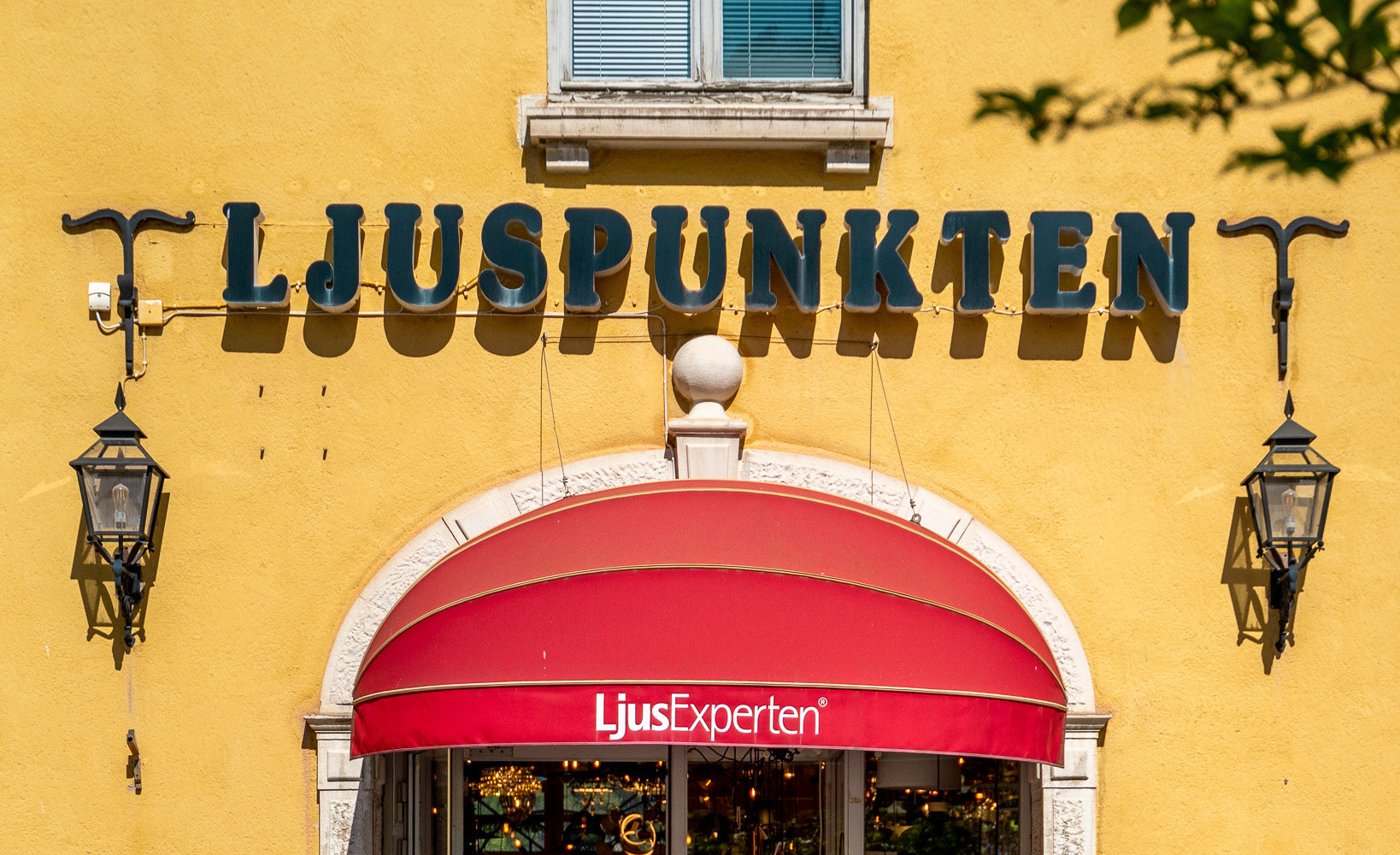
The inspiration directly went to the old sign on the building, a sign that had been there for multiple decades but hadn't been in use as a logo for many years. The sign was traced and became the foundation in the new logo. I also experimented with dots in the logo, a play with words on the name of the store "The Light Dot/Point".
The colours took inspiration from a trendy interior design aesthetic and blended well with the interior of the store itself.
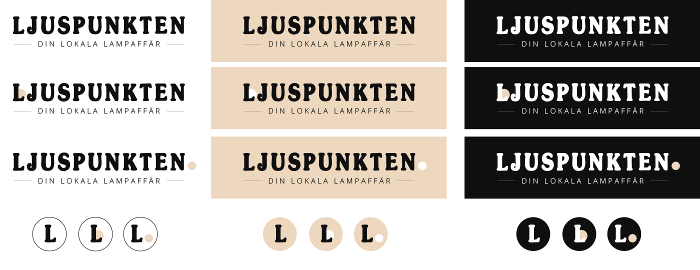
After the frist round, the client's input led to us pursuing the first option, the cleanest one without dots. They also wanted more local connection so the tagline was changed. The colours were also adjusted a bit.