THE TASK
A telecom company approached us with the wish to attract younger business owners to their services. They already had a strong client base, but lacked clients in that specific audience. The strategy was to focus the communication on social media, with both organic and paid content speaking to the younger crowd.
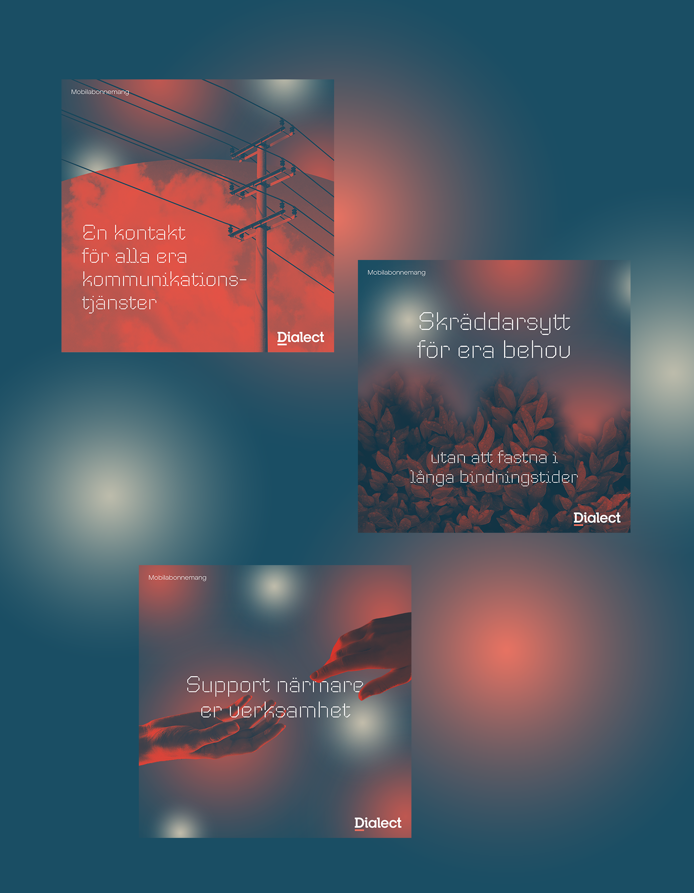
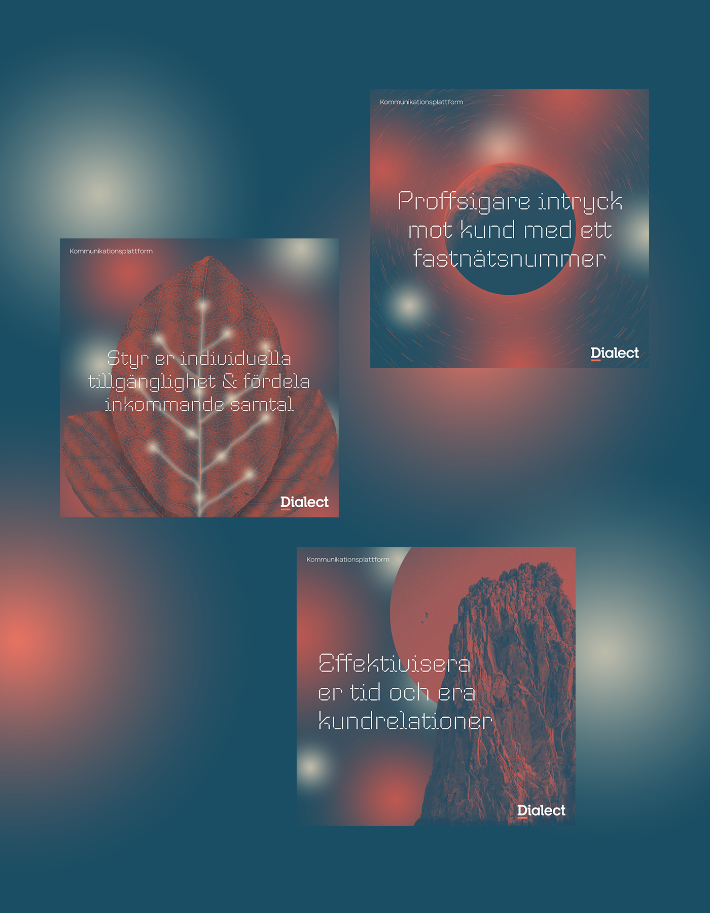
A brand refresh for this specific campaign was needed to differentiate from the existing somewhat corporate visual identity. I was tasked with creating the new look along with graphics and animations in that style.
THE EXISTING BRAND
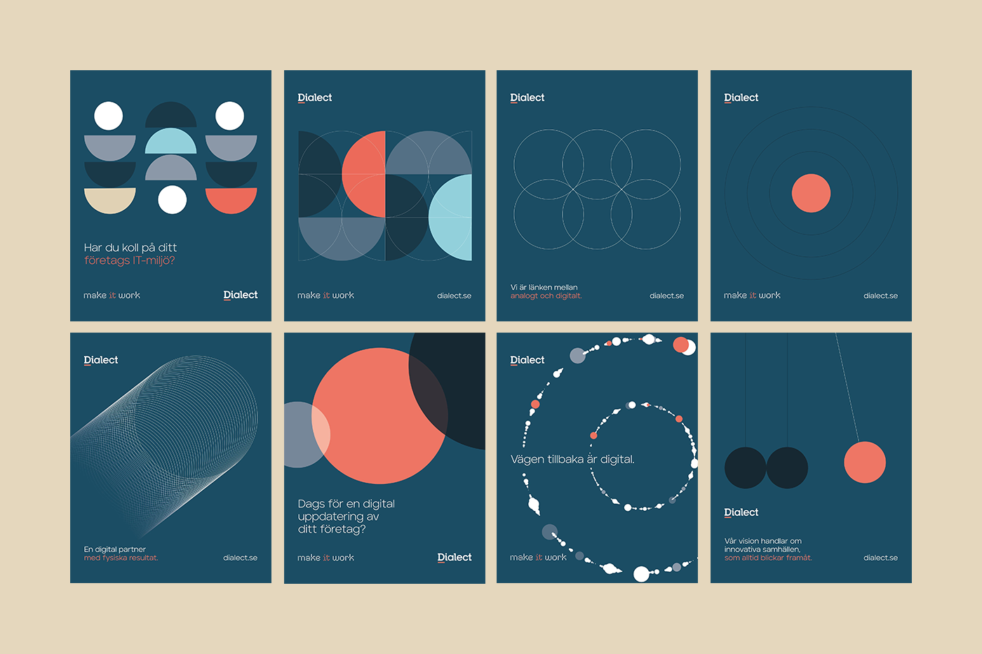
Starting off, the brand already had a distinct visual identity with colors, typefaces and some graphical elements. The idea was to bring in another dimension by modernizing a bit, adding some life and developing a few new recurring systems. Systems that built on the existing brand so that we wouldn't move too far away from it.
Below are some examples of the existing brand.
MY TAKE
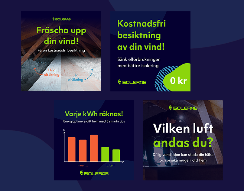
By using photographs and coloring them in the brand's colors, we got rooted more in reality without losing the immersion. The gradient "blobs" along with a new way of using circles (strongly associated with the brand) brought some life and a modern feel. All in all the style came to be a bit sci-fi so the music and sound effects was picked to fit that vibe. The language used in the texts was very important and the goal was to sell reliability and relatability through short and snappy messages.
A short video and three still graphics each for their two biggest services were developed for the initial presentation to the client. The new style later also went to be used outside this specific campaign, on billboards and other signage.